8.3
Building the responsive grid CSS file
The first thing to do is create the grid.css file. The grid.css file is a file that we are creating for the website (it is not a third party file) and so it will live in the 11-resources folder; and since it is a CSS file it will be stored in the 01-CSS subfolder—this is the same place as style.css.
To create the file in Brackets, expand the folder structure in the left hand side bar and then right click the 11-resources/01-css folder and select (Figure 8.7).
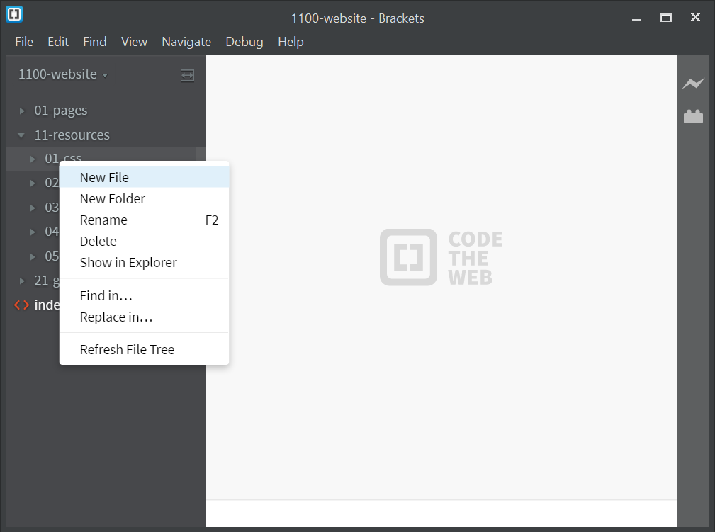
Figure 8.7 Create the grid.css file
Rename the new file as grid.css and we’re ready to go.
Ok, how to do it? Any ideas?
This is what I thought of, and to demonstrate I’m just going to build the arrangement I want for the website (that is row 1 in Figure 8.2). I’ll then expand it for all the other combinations—it’s ok, won’t take more than a week or two.
My idea is that each set of columns should be held in a row container. In the HTML this would be a <div> element and it would have a class called rg-row (responsive grid row—boundless imagination).
Then within the row <div>, there would be another <div> for each column. Like this (this is the index.html file we created in Code 7.1):
    <body>
        <div class="rg-row">               <!-- ROW CONTAINER -->
            <!-- LEFT  COLUMN -->
            <div class="rg-col rg-span1-5>
                Col L
            </div>
            <!-- MIDDLE COLUMN -->
            <div class="rg-col rg-span3-5">
                Col M
            </div>
            <!-- RIGHT COLUMN -->
            <div class="rg-col rg-span1-5">
                Col R
            </div>
        </div>
    </body>
| Code 8.1 index.html |
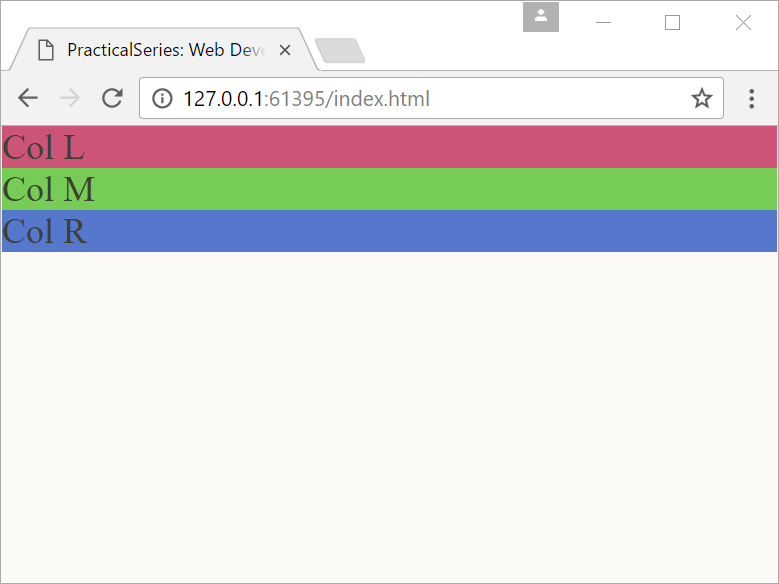
And boy does it look good:
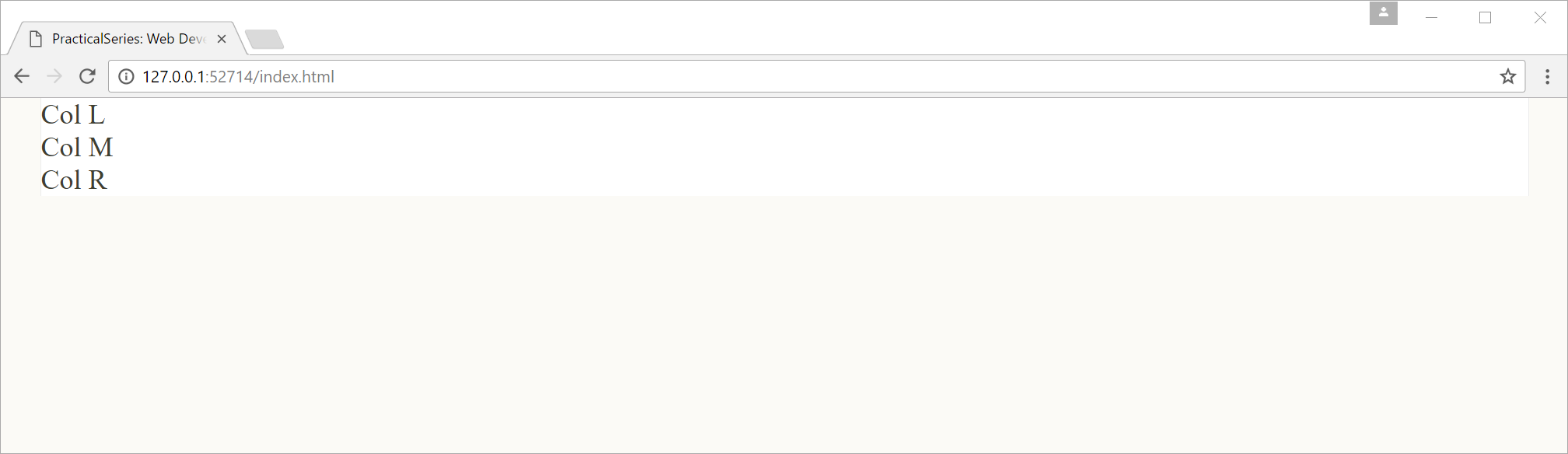
Figure 8.8 index.html (column div elements)
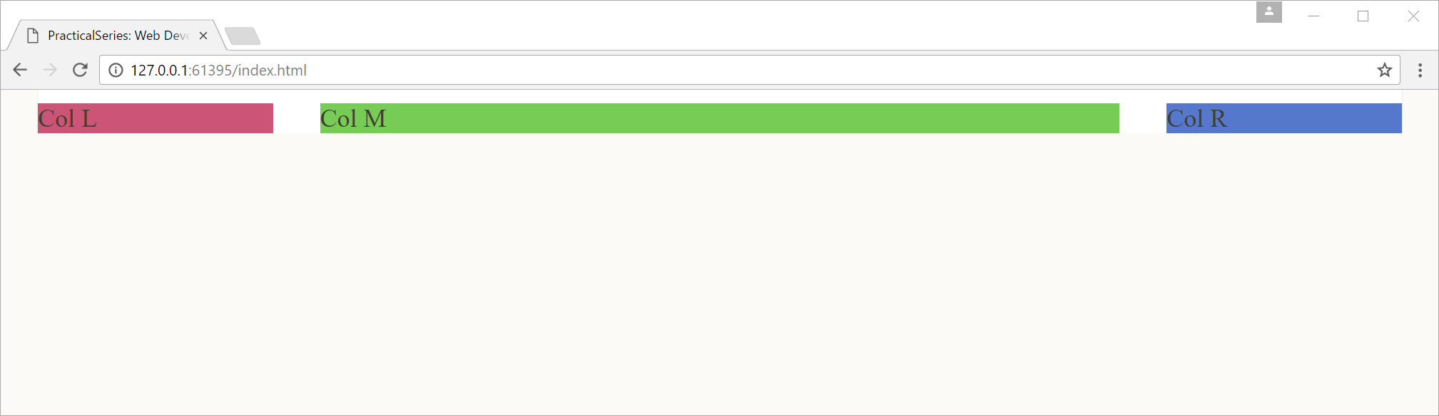
I’m showing the results in a browser that is wider than the maximum body width of 1276 px; hence the cream coloured edges.
The text shows where the columns are, Col L is in the left column, Col M the middle column and Col R the right column (they will be columns when we’ve finished).
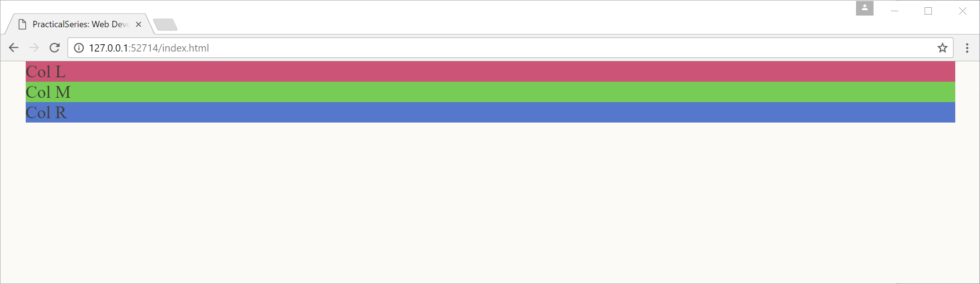
Let’s add a bit of colour to each column area to make things clearer (this is similar to what I did in § 6.4.This time I will use inline styling in the HTML, add the following background style to each of the column div elements:
    <body>
        <div class="rg-row">               <!-- ROW CONTAINER -->
            <!-- LEFT  COLUMN -->
            <div class="rg-col rg-span1-5" style="background-color: #c57">
                Col L
            </div>
            <!-- MIDDLE COLUMN -->
            <div class="rg-col rg-span3-5" style="background-color: #7c5">
                Col M
            </div>
            <!-- RIGHT COLUMN -->
            <div class="rg-col rg-span1-5" style="background-color: #57c">
                Col R
            </div>
        </div>
    </body>
| Code 8.2 index.html |
The inline style attribute is another way of applying CSS to an HTML element, in this case it is applied directly from within the HTML file itself (I discussed it briefly § 5.3, point 1 in the list).
By adding the style attribute, it’s possible to insert CSS rules that style the element, directly in the element in the HTML file:
<div class="rg-col rg-span1-5" style="background-color: #c57">
The style="background-color: #c57" applies a colour of #c57 (reddish) to the background of the <div> element, the entry in quotes is just CSS code, if you need more than one declaration, just put a semicolon after each (just like CSS but without the braces).
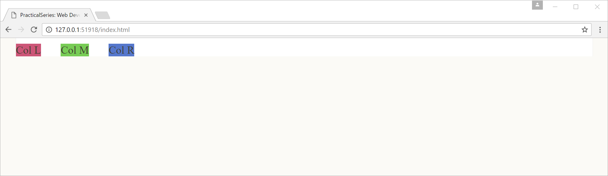
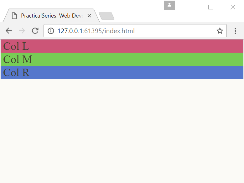
The style attribute in the first column <div> turns it red, the second <div> green and the last blue. Now we get:

Figure 8.9 index.html (coloured div elements)
Ok, now we do the rest in CSS—rg-row first:


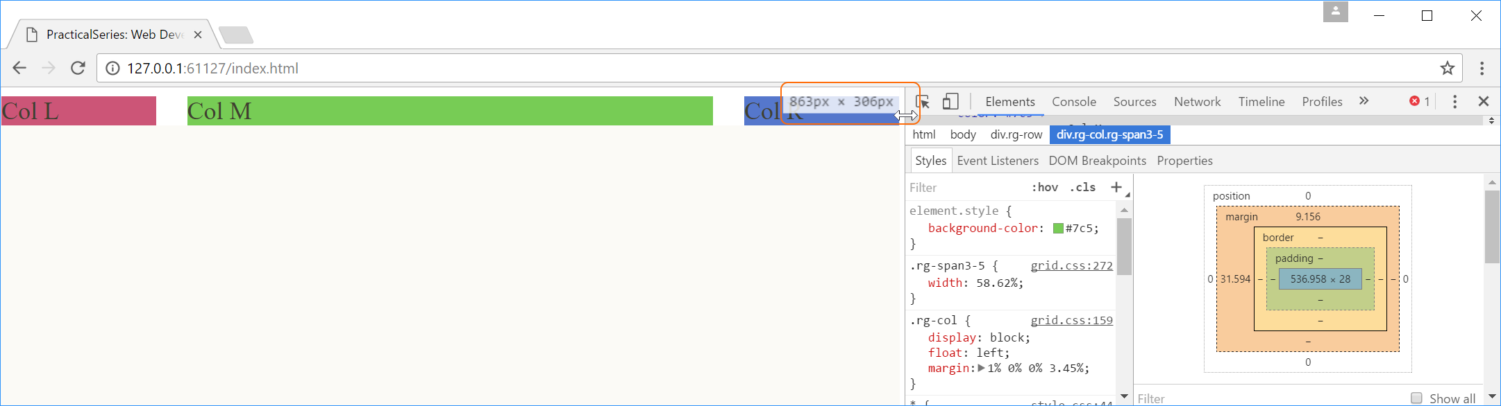
 when it hovers over the divider; I’ve highlighted it in orange in